Plotting Spot Rate Curves
Source:vignettes/spot-rate-curve-plotting.Rmd
spot-rate-curve-plotting.RmdVisualization of yield curves is fairly relevant and the package
fixedincome brings the usual plot function to create plots
with the SpotRateCurve objects and also a ggplot2 set of methods that
helps with the visualization of the term structures using all ggplot2
features.
Before the start let’s get the necessary packages loaded.
As the second step, the yield curve must be created and this is done with data from {rb3} package.
refdate <- as.Date("2022-08-09")
yc_ <- yc_get(refdate)
fut_ <- futures_get(refdate)
yc_ss <- yc_superset(yc_, fut_)
yc <- bind_rows(
  yc_ss |> slice(1),
  yc_ss |> filter(!is.na(symbol))
) |>
  filter(!duplicated(biz_days))

curve <- spotratecurve(
  yc$r_252, yc$biz_days, "discrete", "business/252", "Brazil/ANBIMA",
  refdate = refdate
)
base::plot
plot(curve)
plot(curve, show_forward = TRUE)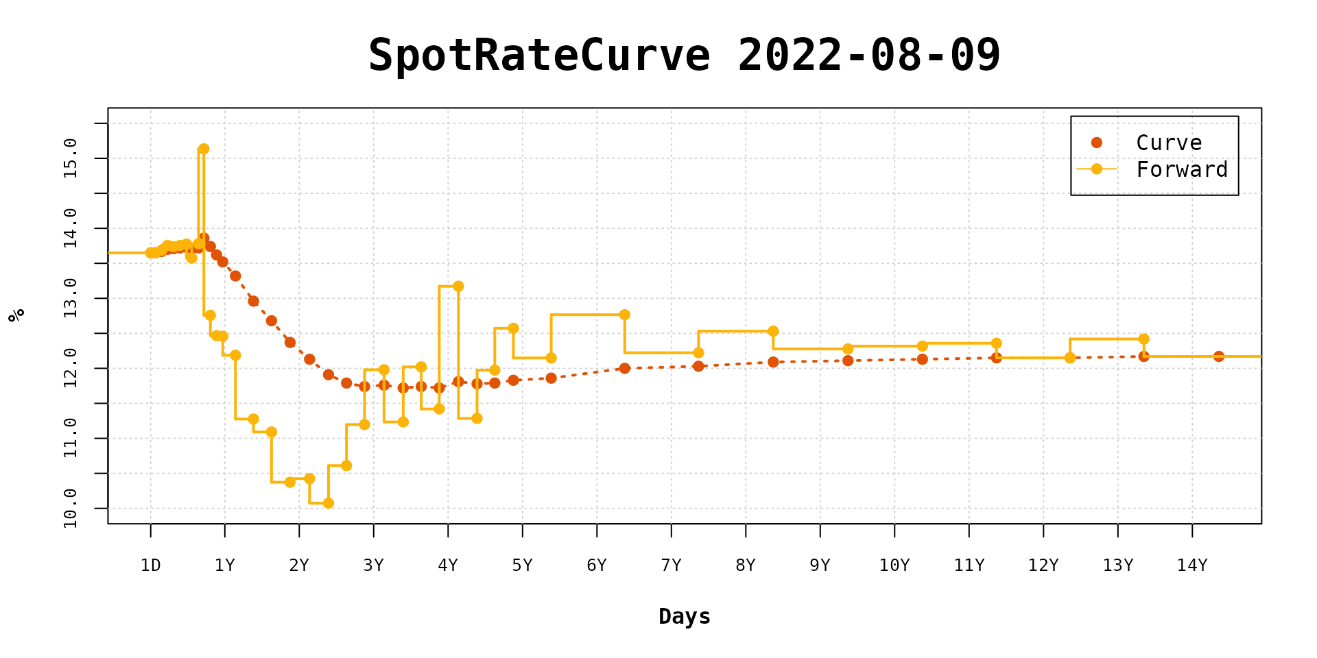

curve_2y <- curve |> fixedincome::first("2 years")
interpolation(curve_2y) <- interp_naturalspline()
plot(curve_2y, use_interpolation = TRUE)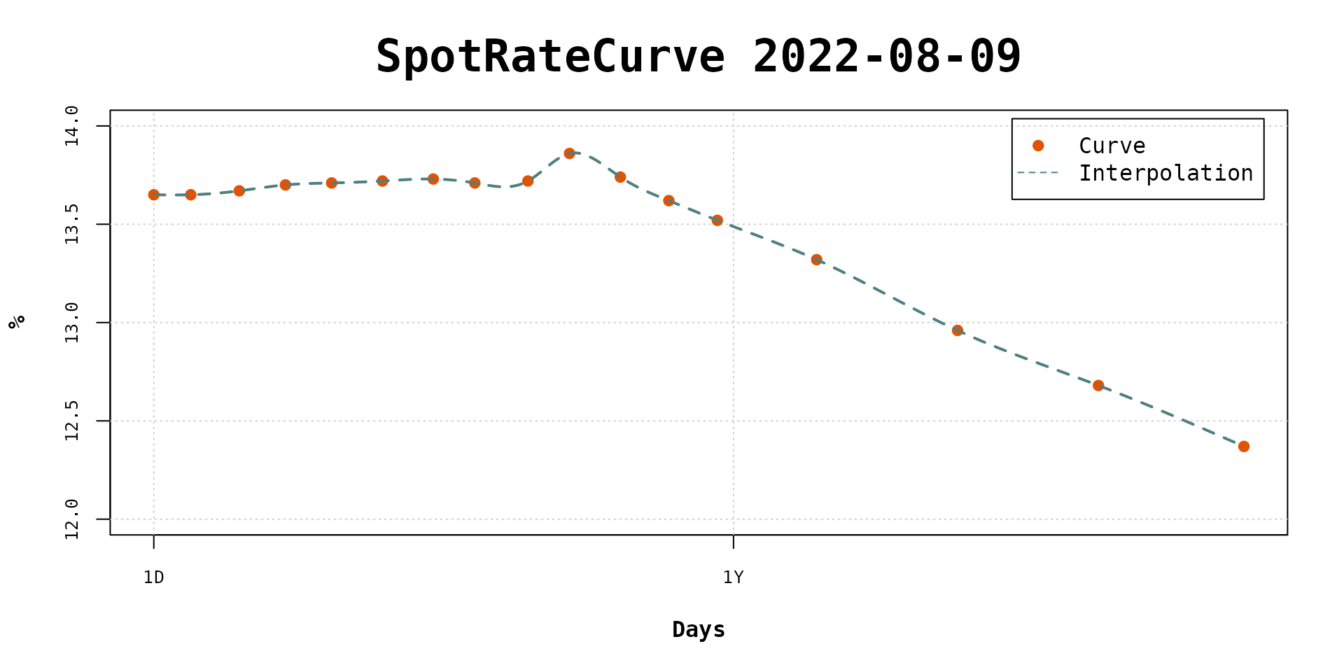
plot(curve_2y, use_interpolation = TRUE, show_forward = TRUE)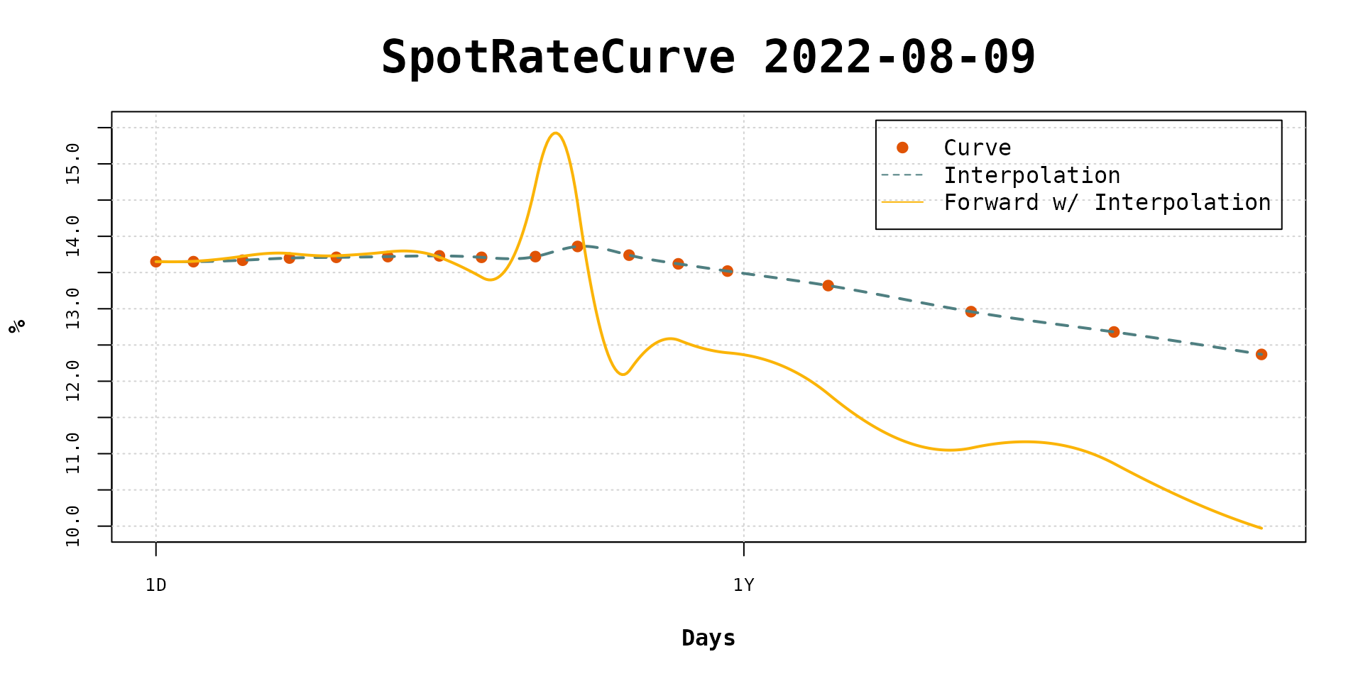
plot(curve_2y, use_interpolation = TRUE, show_forward = TRUE, legend_location = "bottomleft")
ggplot2
ggspotratecurveplot(curve,
  title = "DI1 spot rates", subtitle = format(refdate), caption = "Data from {rb3} package"
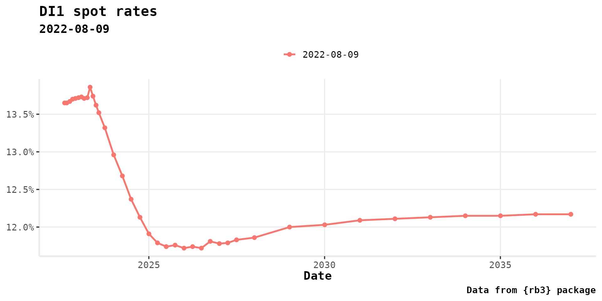
)
ggspotratecurveplot(curve,
  title = "DI1 spot rates", subtitle = format(refdate), caption = "Data from {rb3} package",
  curve.x.axis = "terms"
)
ggspotratecurveplot(curve,
  title = "DI1 spot rates", subtitle = format(refdate), caption = "Data from {rb3} package"
) +
  autolayer(forwardrate(curve), size = 1)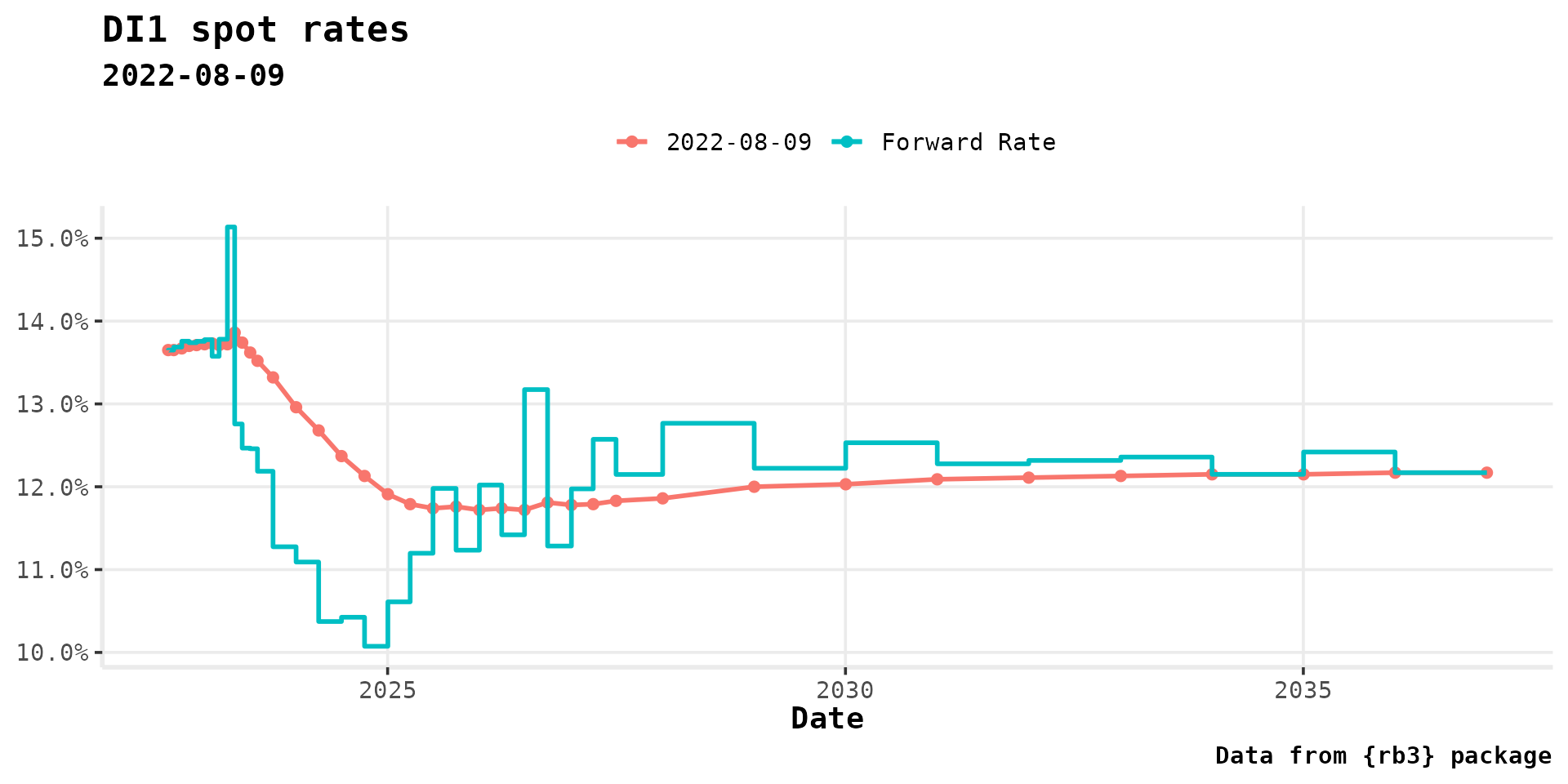
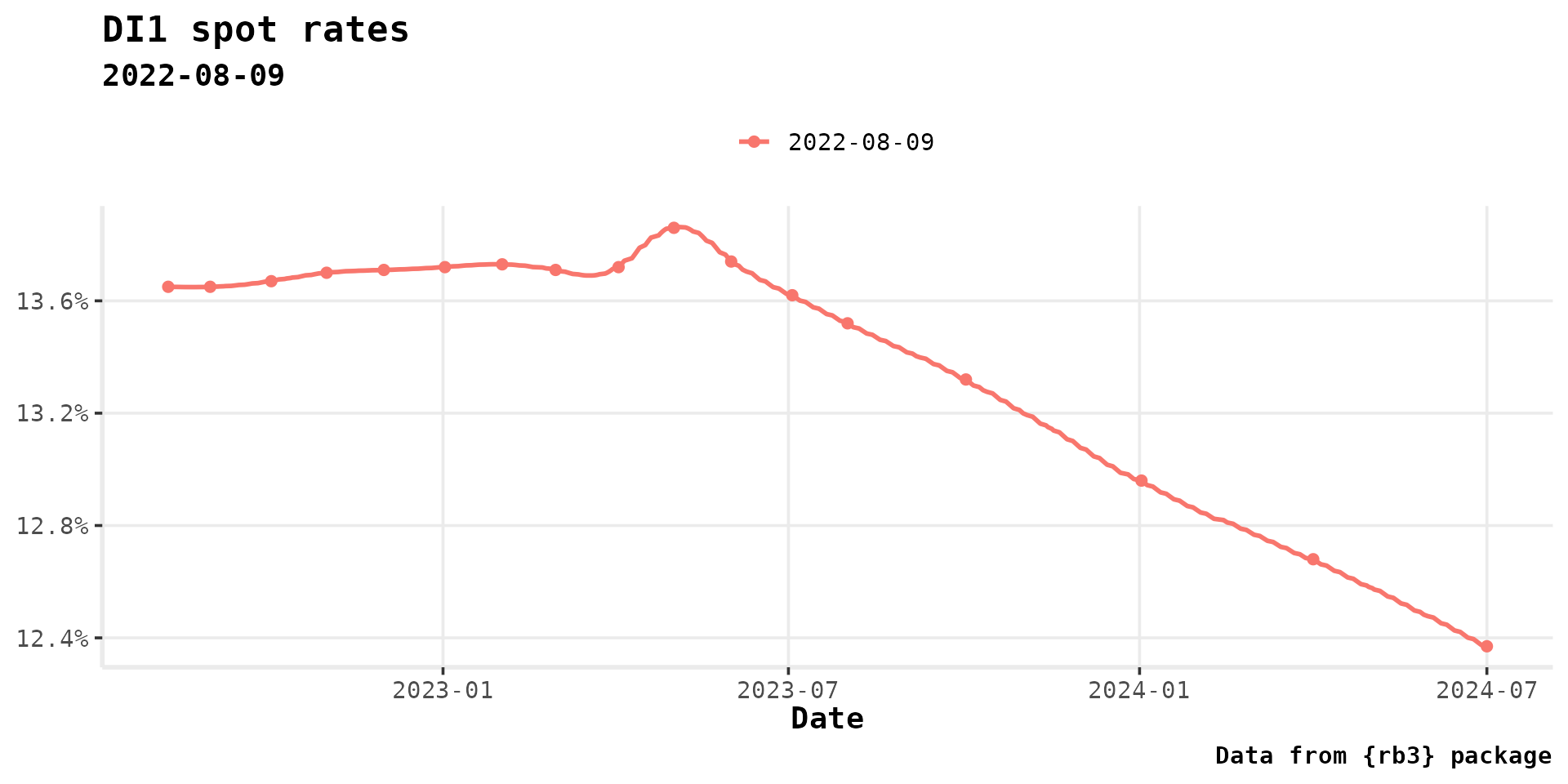
ggspotratecurveplot(curve_2y,
  title = "DI1 spot rates", subtitle = format(refdate), caption = "Data from {rb3} package",
  curve.interpolation = TRUE
)
autoplot(curve_2y, curve.geom = "point") +
  autolayer(curve_2y, curve.geom = "line", curve.name = "Interpolation", curve.interpolation = TRUE)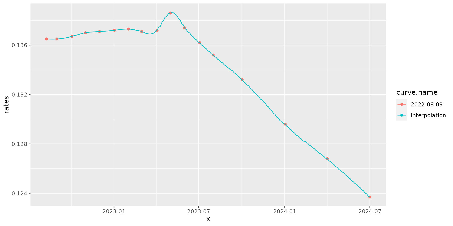
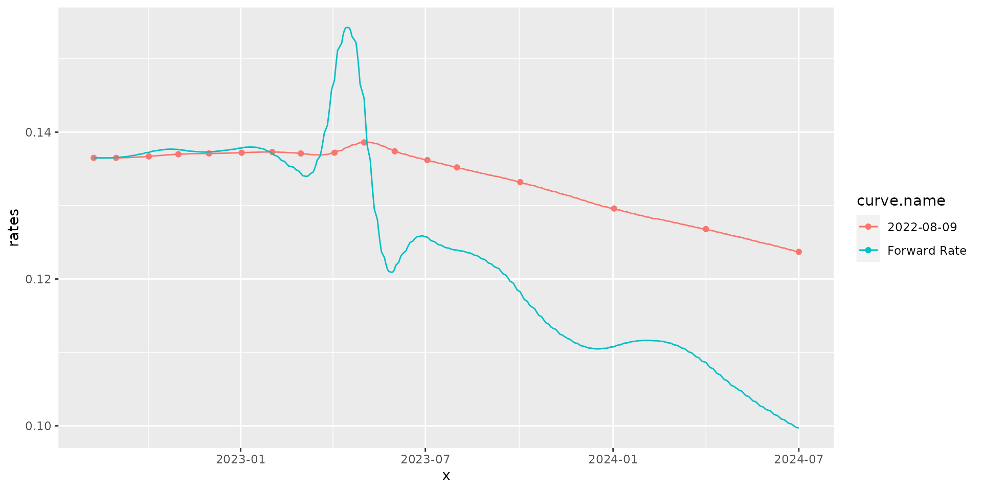
terms_ <- do.call(seq, as.list(range(curve_2y@terms)))
curve_2y_interp <- curve_2y[[terms_]]
autoplot(curve_2y, curve.geom = "point") +
  autolayer(curve_2y_interp, curve.geom = "line") +
  autolayer(forwardrate(curve_2y_interp),
    curve.geom = "line", curve.name = "Forward Rate"
  )
Plotting Multiple Curves
refdate2 <- as.Date("2022-03-09")
yc_ <- yc_get(refdate2)
fut_ <- futures_get(refdate2)
yc_ss <- yc_superset(yc_, fut_)
yc <- bind_rows(
  yc_ss |> slice(1),
  yc_ss |> filter(!is.na(symbol))
) |>
  filter(!duplicated(biz_days))

curve2 <- spotratecurve(
  yc$r_252, yc$biz_days, "discrete", "business/252", "Brazil/ANBIMA",
  refdate = refdate2
)
ggspotratecurveplot(curve,
  title = "DI1 spot rates", caption = "Data from {rb3} package",
  curve.x.axis = "terms"
) +
  autolayer(curve2, curve.x.axis = "terms", size = 1) +
  autolayer(curve2, curve.geom = "point", curve.x.axis = "terms", size = 2)
curve2_2y <- curve2 |> fixedincome::first("2 years")
ggspotratecurveplot(curve_2y,
  title = "DI1 spot rates", caption = "Data from {rb3} package",
  curve.x.axis = "terms"
) +
  autolayer(curve2_2y, curve.x.axis = "terms", size = 1) +
  autolayer(curve2_2y, curve.geom = "point", curve.x.axis = "terms", size = 2)